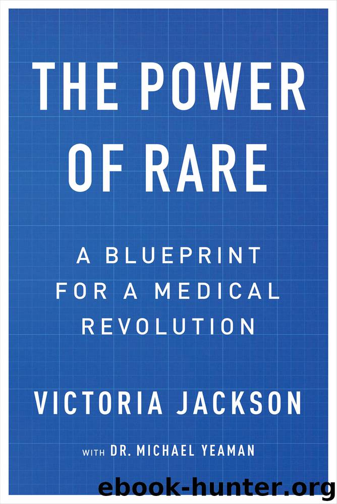
The Power of Rare by Victoria Jackson

Author:Victoria Jackson
Language: eng
Format: epub
Publisher: Regan Arts.
THE COLORS OF HOPE
As an entrepreneur and a visual thinker, coming up with a logo at the start of our marketing efforts was clearly in my wheelhouse. Still, I can remember first sitting down to design it, being hard-pressed to settle on a concept that would become the centerpiece of a communications platform. Why was branding our cause so important? Why did it matter so much that we embodied rare in our messaging?
In the business world, those questions might not even have to be asked. But in the medical field—and even for many philanthropists—such essential aspects of communicating your goals to the world have often been ignored. Only recently have top medical schools and healthcare policy programs started to enlist business-savvy professors to add instruction about marketing strategies for causes and cures.
In our case—starting at the time when there was no reference point at all for what this mystery disease even was and who we were—we needed a coat of arms, a flag, an image of some kind. We needed a true north for NMO to identify our mission. Branding ourselves as offering a rare approach to a rare disease gave us a powerful slogan. A strong step in the right direction. But because the real test of branding is how it instantly links a message to the mind, we needed an iconic logo to tell our story in the blink of an eye—without words.
A memorable brand identity could serve as a springboard to all media—from TV and commercial press to academic publications, to the creation of everything from our own films, books, and live lectures to streamed webinars and other digital content delivered with the latest technology. My intention was to weave a consistent message into every aspect of how we presented the Foundation and our vision to the world—starting with this emblem and its colors. Only, what would that be?
All I could think about as I sat staring at a blank page was my desire that the logo and the color palette convey a sense of hope and courage. I wanted the imagery to be uplifting and appear to be full of light. We were in the throes of feeling acute darkness, and I didn’t want people to look at any of our materials and feel they were in the dark at all. That was me thinking like a makeup artist: light versus dark, highlight versus shadow, subtlety versus heaviness. What other concepts came to mind?
Community. Family. Love. Curing. Living. Growing. Organic. Life.
A story began to take form in images. There was shape, color, texture, pattern, and meaning. The logo was born.
Did it matter if anyone outside our circle knew of the symbolism of the tree branch with two leaves representing Bill and me, along with three other leaves representing Ali and her two brothers? Not to me. What mattered was that when anyone looked at the logo, our website, and our other multimedia materials that were framed in foliage of many shades of green, they saw the growth and healing that comes from being part of a natural and growing purpose.
Download
This site does not store any files on its server. We only index and link to content provided by other sites. Please contact the content providers to delete copyright contents if any and email us, we'll remove relevant links or contents immediately.
Hit Refresh by Satya Nadella(8351)
When Breath Becomes Air by Paul Kalanithi(7285)
The Girl Without a Voice by Casey Watson(7276)
Do No Harm Stories of Life, Death and Brain Surgery by Henry Marsh(6346)
A Court of Wings and Ruin by Sarah J. Maas(6135)
Hunger by Roxane Gay(4241)
Shoe Dog by Phil Knight(4194)
Everything Happens for a Reason by Kate Bowler(4079)
A Higher Loyalty: Truth, Lies, and Leadership by James Comey(4047)
The Rules Do Not Apply by Ariel Levy(3924)
Tuesdays with Morrie by Mitch Albom(3853)
The Immortal Life of Henrietta Lacks by Rebecca Skloot(3838)
How to Change Your Mind by Michael Pollan(3693)
Millionaire: The Philanderer, Gambler, and Duelist Who Invented Modern Finance by Janet Gleeson(3585)
All Creatures Great and Small by James Herriot(3532)
Elon Musk by Ashlee Vance(3465)
Tokyo Vice: An American Reporter on the Police Beat in Japan by Jake Adelstein(3451)
Man and His Symbols by Carl Gustav Jung(3336)
The Money Culture by Michael Lewis(3300)
